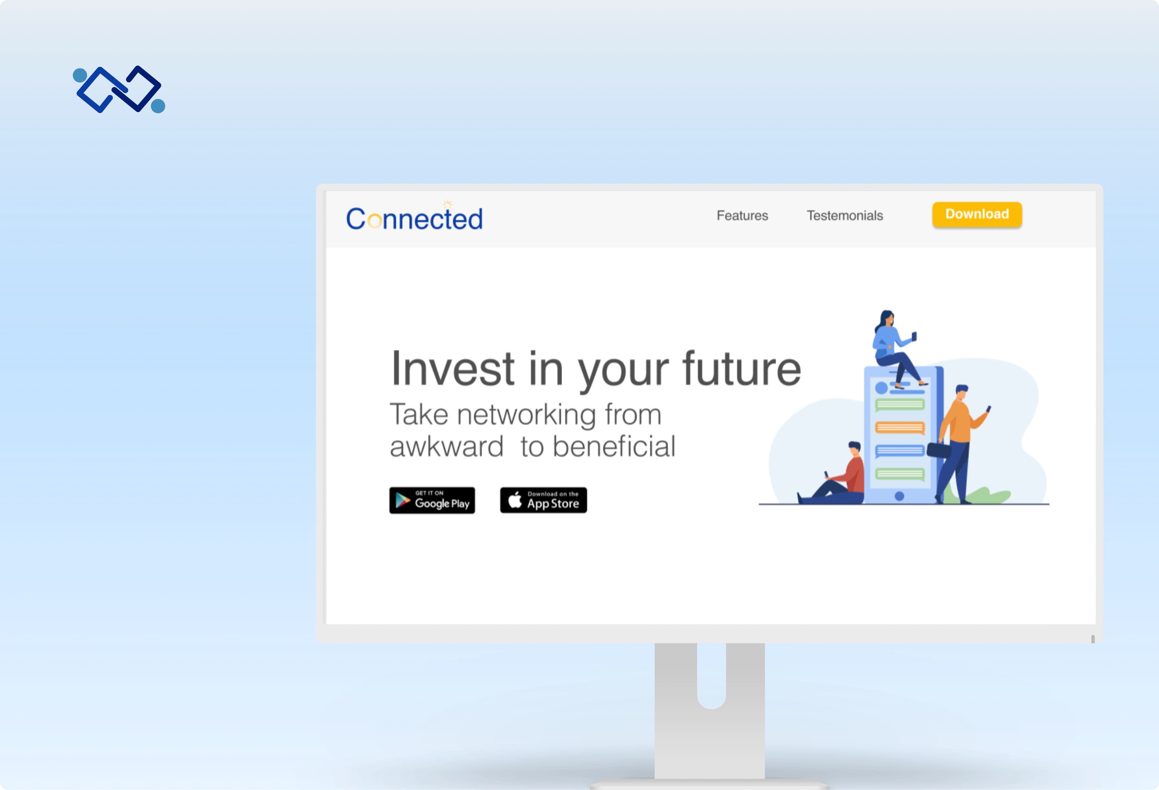
Connected
A digital solution which takes networking from awkward to beneficial. It helps facilitate the conversation, find your ideal mentor and helps you connect with like minded individuals.
Timeline: 10 Week Solo Projet
My Role: UX Design, UX Research, UI Design, Marketing Strategy
Tools: Figma, Sketch, Invision
The Problem
Many young professionals seek guidance in their professional careers, they often attend networking events to find such guidance. Research shows the traditional networking environment is not the most beneficial for young professionals, especially individuals who are more shy or introverted. They feel awkward approaching someone new and the pressure of making an instant connection is overwhelming for them.
There is an opportunity to make the networking experience more beneficial for young professionals.
How might we make remote networking experiences more useful for individuals seeking social guidance and mentorship in order to transition their careers and expand their network?
The Solution
Create a sense of community, and facilitate the social interaction between young professionals and mentors
Research
Project Constraints
Assumptions and User Interviews
My ultimate goal for this project is to use a user-centered design process to better understand user needs, desires, pain points, and behaviours in order to improve their overall experience with networking. Below are the assumptions I had before interviewing my users, this chart helps me identiy which assumtions can be turned into questions to ask my users during the interviews.
Hypothesis
I believe
The lack of social guidance when it comes to networking events leads participants to not have the most productive or beneficial experience. Primarily due to not knowing how to approach an indsutry professional or being too shy to speak in a crowded room.
I will know I am right when
I see at least 50% of interview participants feel as if they need more social guidance to facilitate social interactions in networking settings, in order to obtain meaningful relationships with peers and industry professionals.
Interview Plan
In order to fully understand the scope of this problem, identify the core issues, and empathize with my users, I conducted 3 qualitative user interviews through zoom. My participants were between the ages 20-40 and they have attended a lot of networking events in the past. I asked my participants specific questions on their networking experiences, what they enjoyed, and what could have been improved.
Synthesis
Interview Findings
By using this qualitative research method, I was able to gain an understanding of what individuals are looking for when it comes to networking events, and what will help them find a mentor while feeling comfortable.
I gathered data from the interviews and organized them by pain points, motivations and behaviours:
After the interview, I was able to sort their pain points into three major themes:
1. Lack of Guidance
2. Nervous talking in big crowds
3. Lack of engaging group activities/ice breakers
Personas
Now that the research phase was concluded, I synthesized my data and created my two main personas. Utilizing a persona allowed me to stay focused on my human centered design approach. I referred back to these personas during the ideation process in order to ensure that the solutions meets the needs of my user.
Primary Persona
An introverted young professional struggling to find a mentor to guide her through her career transition.
Secondary Persona
A busy young adult looking for fitness tips from an industry expert to change his fitness routine.
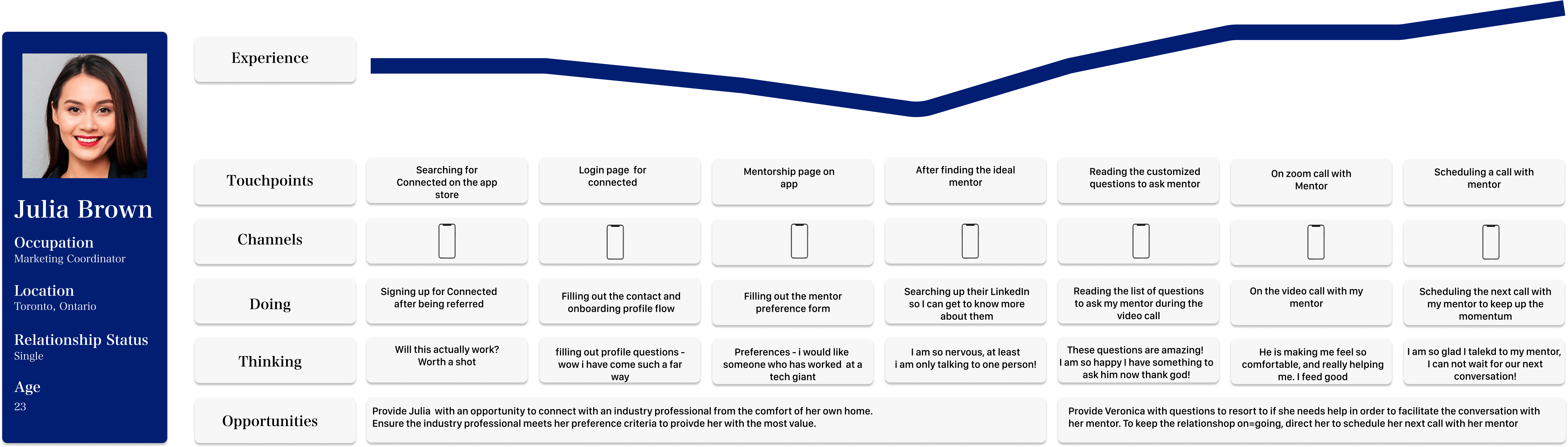
Experience Map
Julia's Journey
To better understand my user and identify pain-points where a design solution could intervene, I created an experience map for Julia as she goes through the process of finding a mentor. Experiences maps help visualize the progression of a probable experience the primary persona might have.
The Ideation
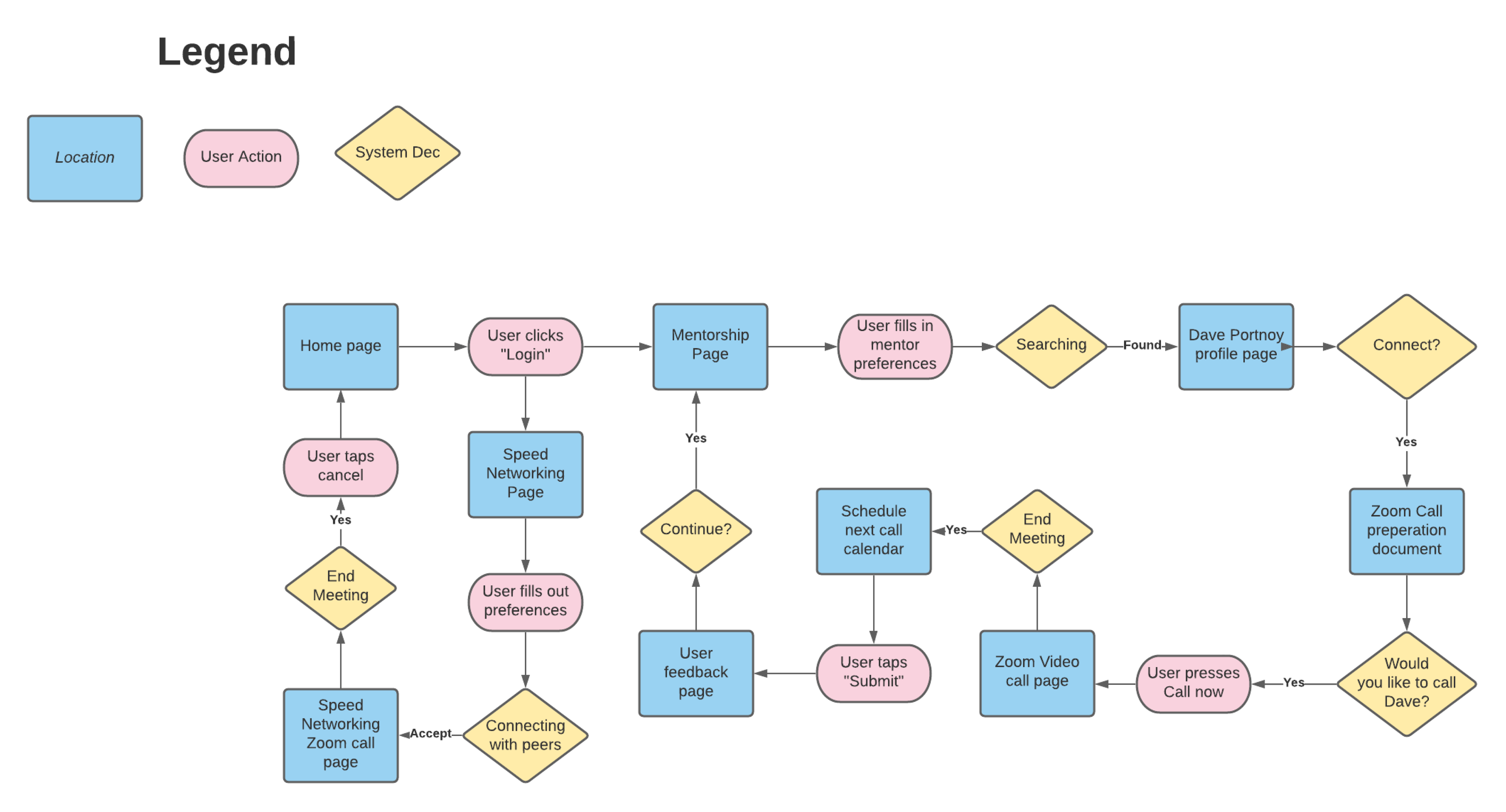
User Stories and Task Flow
In order to identify which features would be required for my solution I created several possible user stories to imagine the actions that my user may take. I determined the two main user stories for my app to be:
As a young adult, I want to speak to an industry professional in UX Design so that I can transition my career and obtain guidance
As a young adult, I want to meet individuals in my industry so that I can relate to someone else and expand my network
Both of these user stories can be categorized into a main epic of facilitating social interactions. These User stories also helped me determine my primary and secondary task flows.
Primary: Connect with mentor based on preferences
Secondary: Connect with like-minded individuals in the same industry
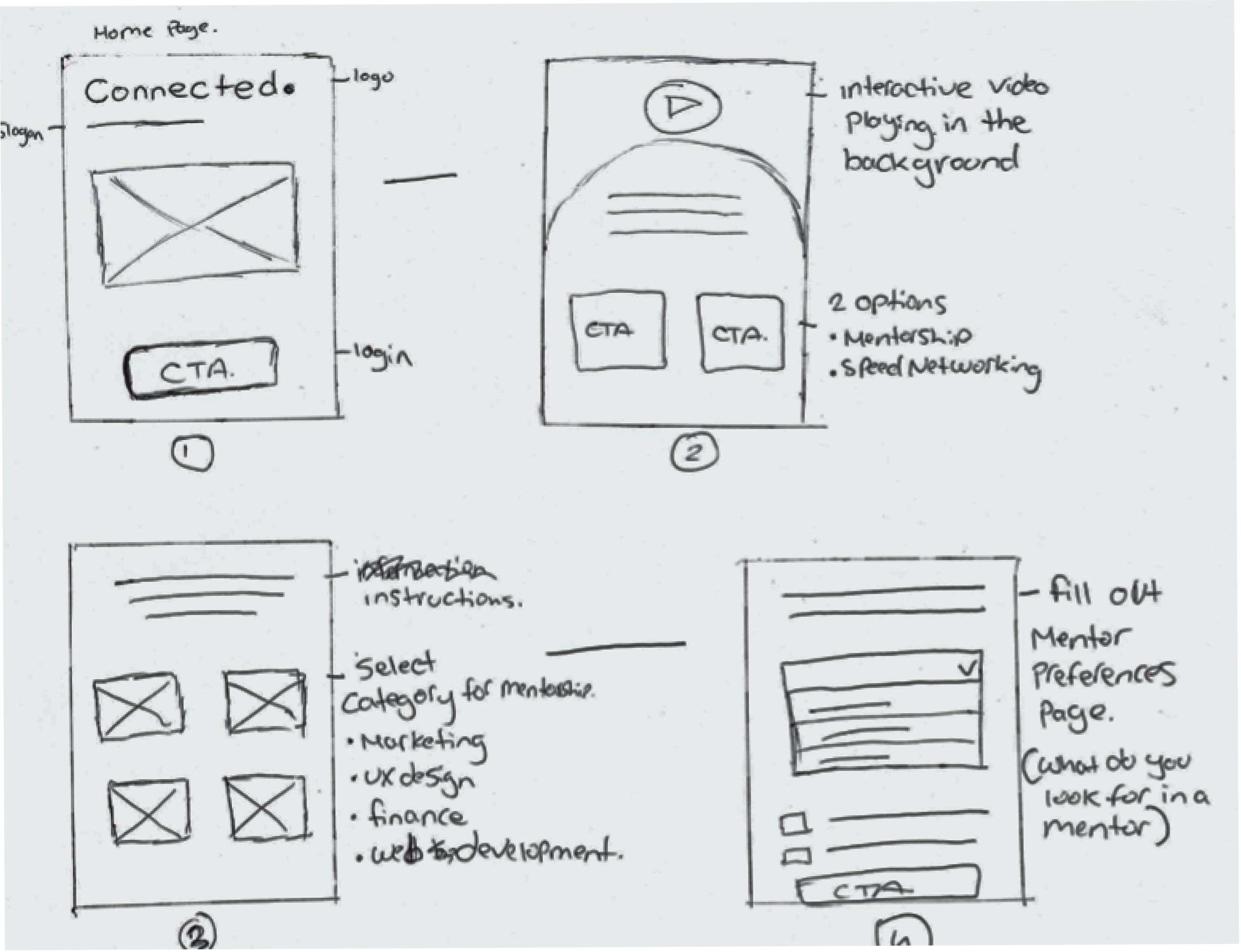
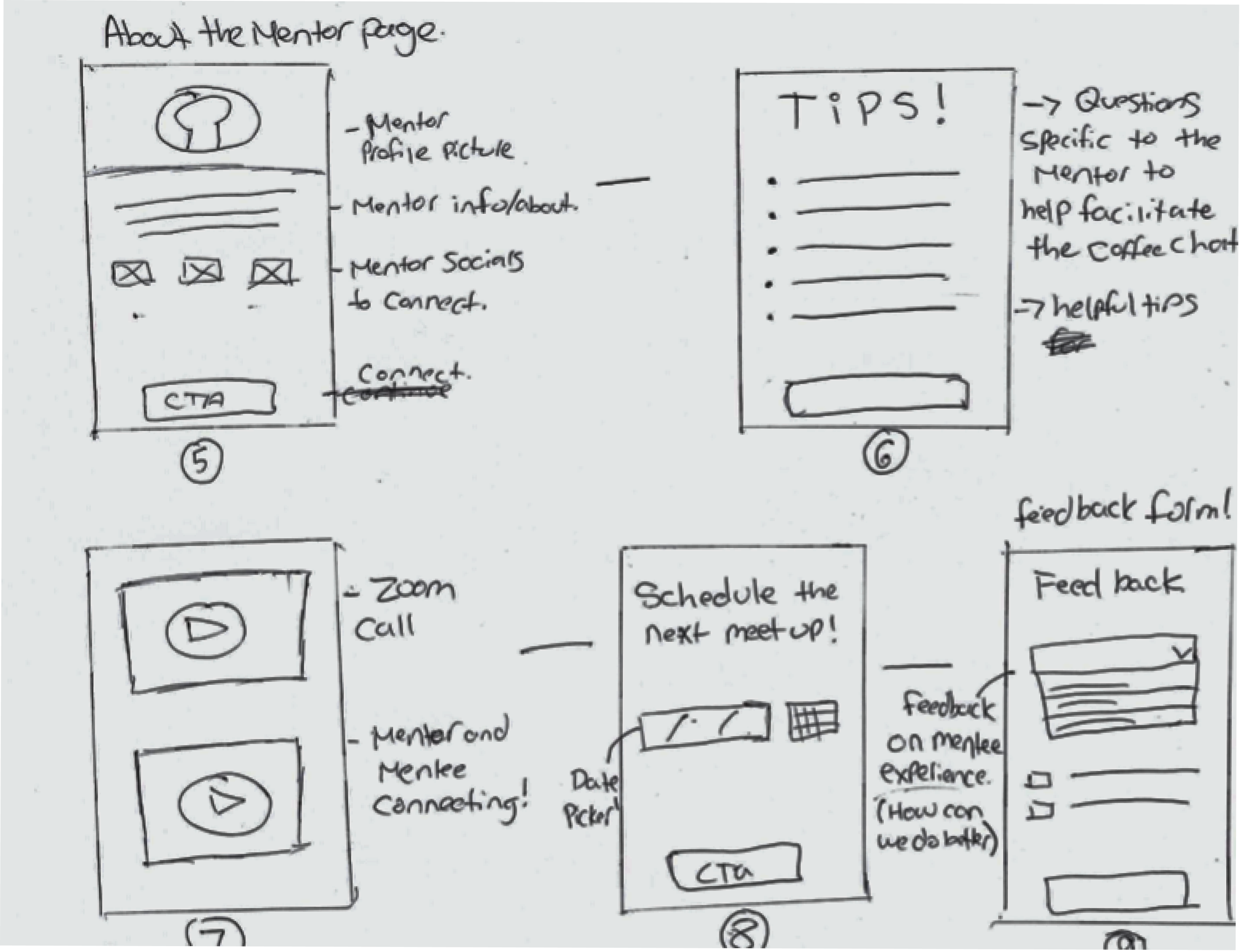
Sketches
Once I got an understanding of the users, their task and stories, I started sketching design solutions. The process of sketching enables me to visualize different ideas and try out content placement.
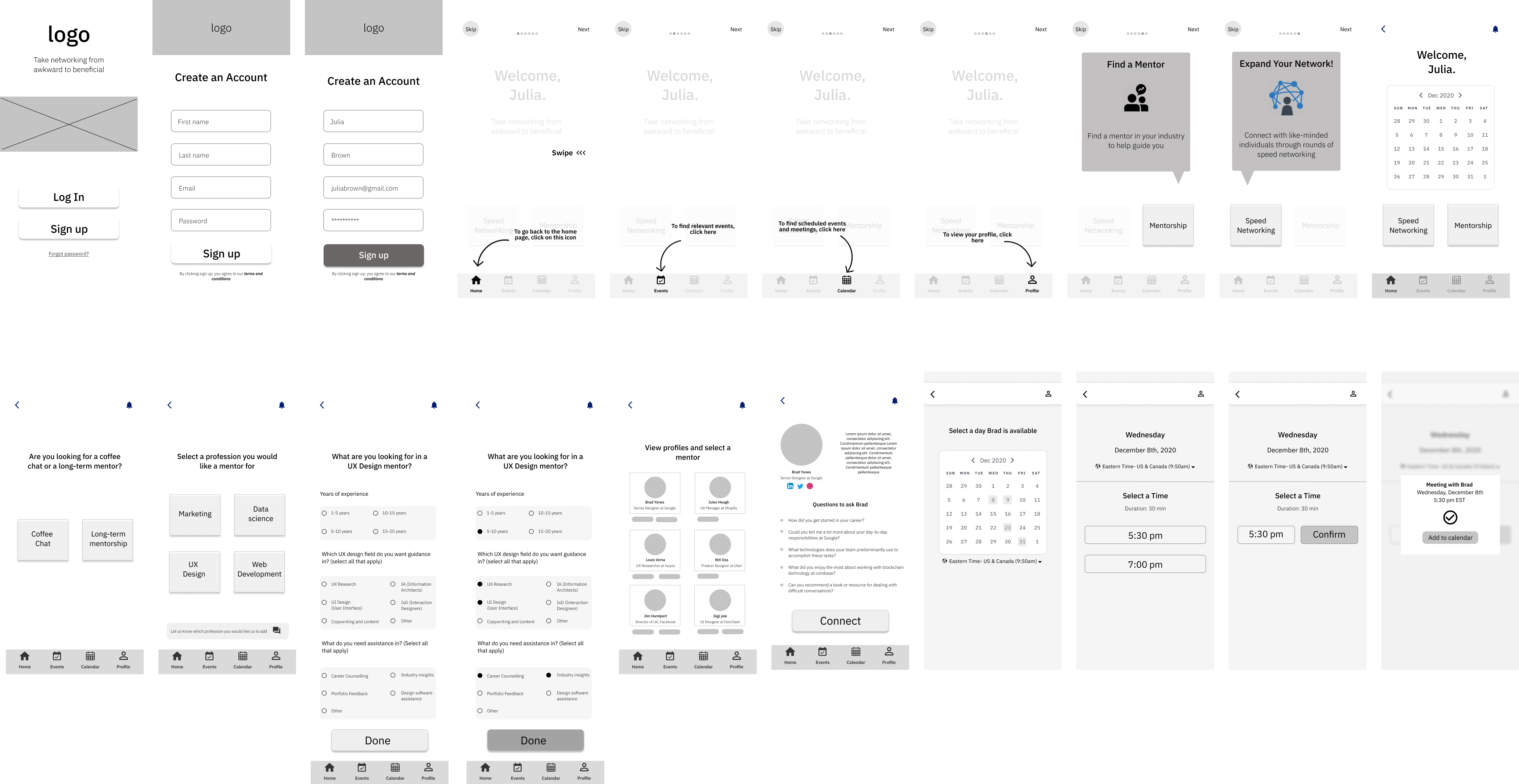
Prototype
Turning the solution and ideas into a digital product
Usability Testing
Usability testing isn't a checklist item. It's a design tool.
The purpose of this it to test out my prototype and obtain practical, real-time feedback that can be incorporated to improve my design and provide a more optimal user experience.
Key Insight Findings:
1. User Onboarding in the beginning is a bit confusing
2. Mentorship and Speed networking flows should be accessible through the global task bar
3. Add more validation points throughout the flow
Testing x1 x2 x3....
I have created 3 prototypes and had 5 people test each one making that a total of 15 usability tests. Following are some of the critical findings from my user tests and how I have made changes based on those insights along with a few of my final UI designs.
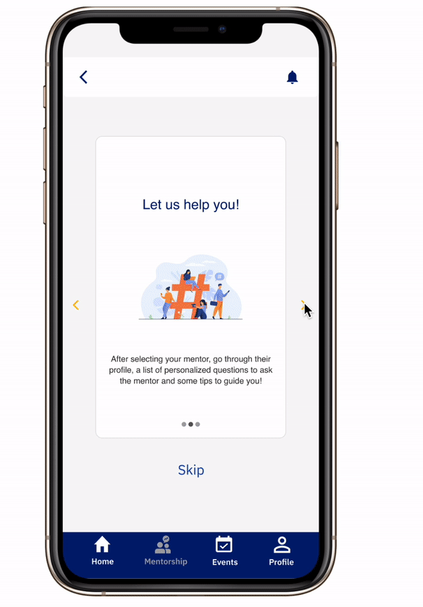
Instead of having the Onboarding flow in the beginning, I integrated the onboarding in the user experience. Once the user selects "mentorship" they will be welcomed with an onboarding flow explaining the feature.
The mentor selection and schedule flow is accessible through the global navigation bar as suggested from a user test. Customized questions are essential for the user persona, this way the user is less stressed out before the mentor video call, more prepared, and they are guaranteed a beneficial outcome from the video call.
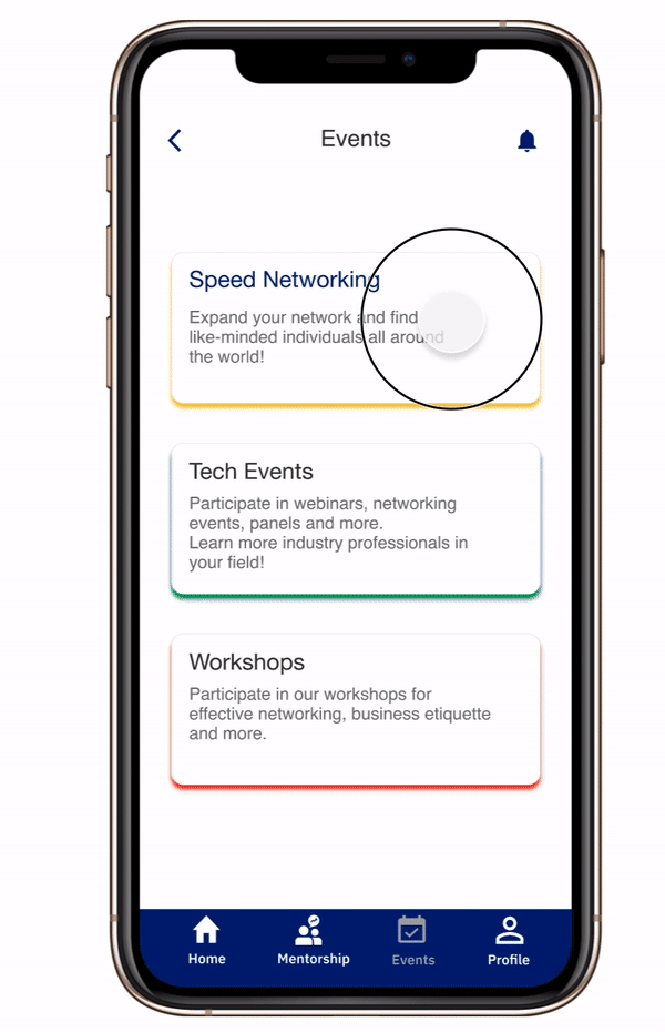
The speed networking feature allows you to build a community by meeting like-minded individuals in the same industry as you. It was important for us to facilitate the conversation on here too. As displayed, each room will have an assigned question for the participants to answer. This way, you can learn more about someone instead of small talk leading no where.
USER INTERFACE DESIGN
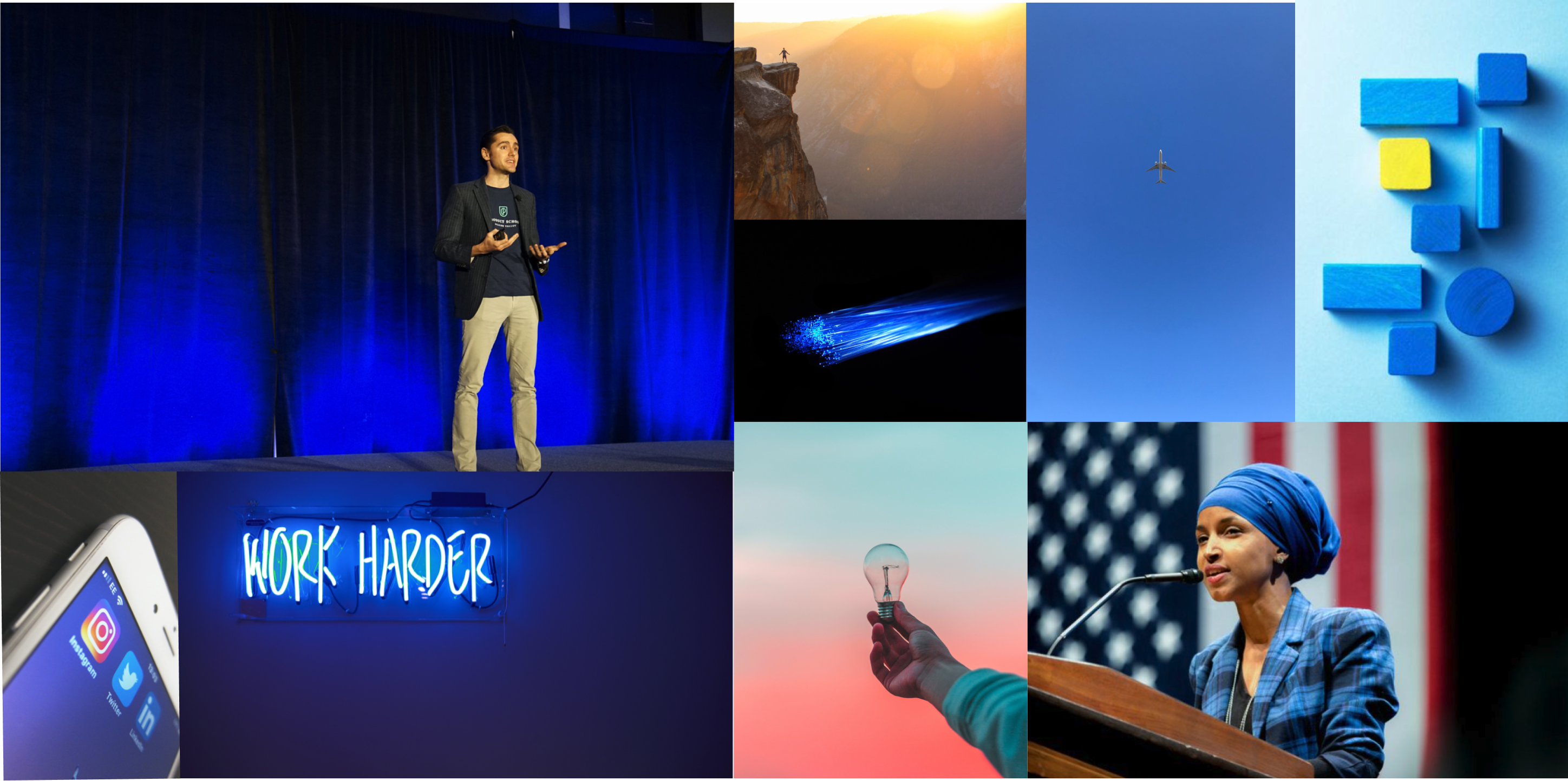
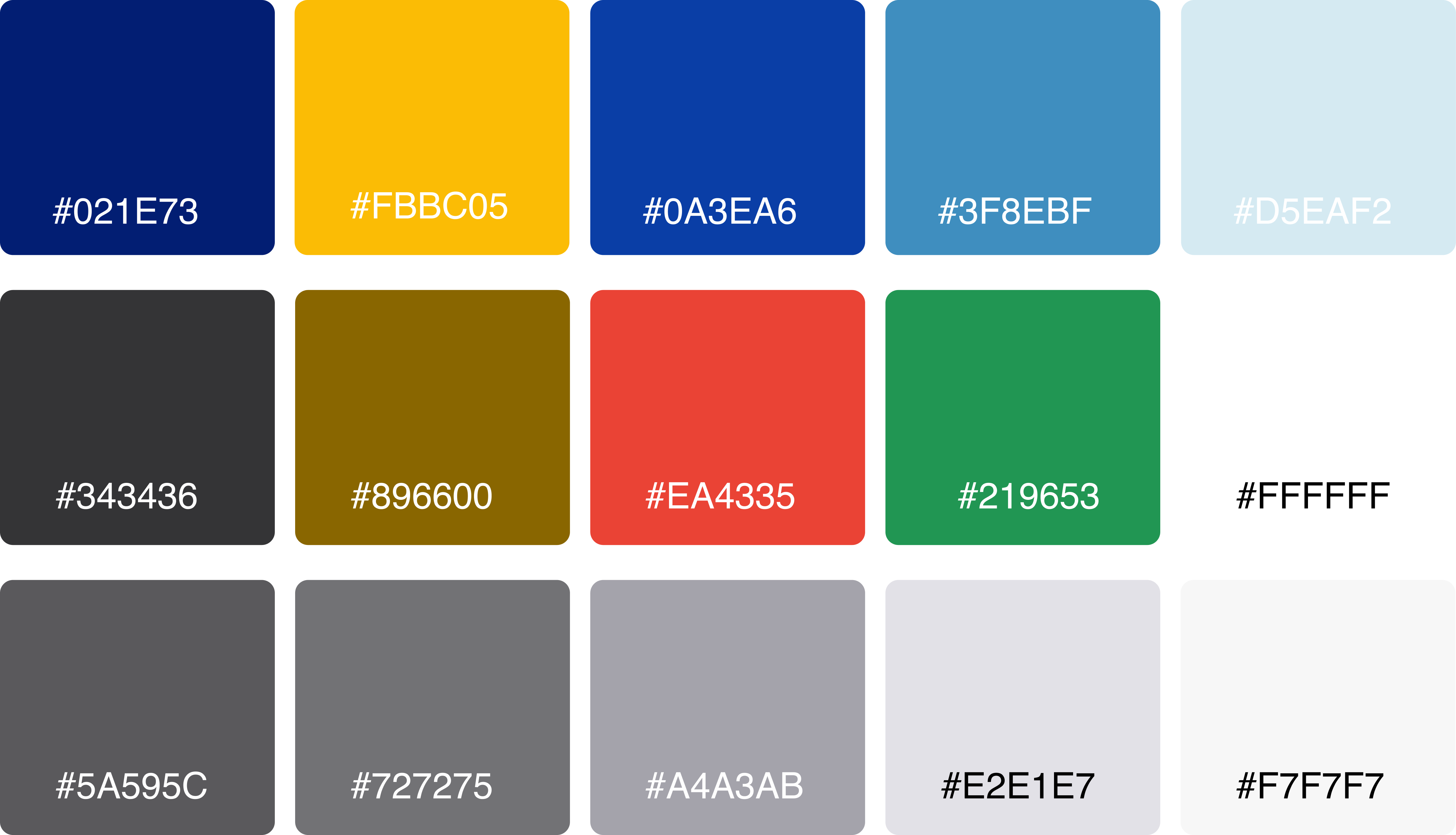
Moodboard and Brand Colours
Before applying colours, I began collecting pictures to create a mood board and identify the colour pallete and brand feel.
The mood and emotions to be evoked from this application are those of trust, hope, and excitement. As a visual designer, I translated these feelings and emotions using colours, hues and saturation. The brand emotional keywords are Exciting, Innovative, Motivational, Professional, new beginnings, and hope.
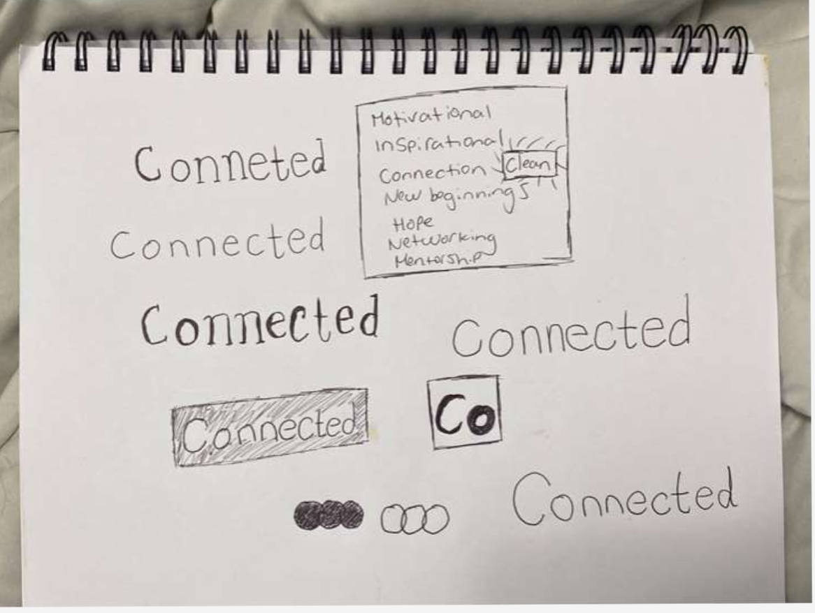
Wordmark
For the creation of my wordmark, I started off by sketching some wordmarks on paper using different fonts. The wordmark should embody the feeling of new beginnings, hope, clean, and professionalism.
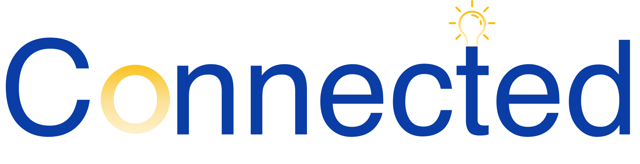
After sketching a few wordmarks and choosing my font, I created a wordmark using my company colours and customizing the look and feel of the wordmark to represent my brand.
Logo and Typography
The logo displays the act of two individuals connecting. I wanted to display the word connection through my logo in a simple manner. I used company colours to represent the brand.
Marketing
Designing for multiple devices
When designing for multiple devices, I considered my key users and what platform would make the most sense for them and their workflow.
A key insight from my users was being comfortable in their own envirornment, and being able to conveniently access their network was important to them.
The Ipad interface allows users to comfortably sit in their preferred envirornment while they video call their mentor or speed network via video with individuals in their industry.
Marketing Website
In order to encourage market uptake, I created a marketing site that details the product functionality and value proposition. It highlights the key features, mentors from big companies you can connect with, testemonials and a how it works demo for the mentorship feature.
Desktop Version
IPhone Version
Next Steps
Add more features to collect user feedback
Its important for connected to always put the user first and advocate for them, I want to continue adding in more features to collect data from the users who use the application. This can be done by adding in more surveys or feedback forms for the users experience connecting with mentors and other like minded individuals.
Expand industry offering + Partner with tech giants
Connected currently offers mentors for 4 industries, such as UX Design, Web Development, Digital Marketing and Data Science. I would like to expand our offerings to more career focused industries by partnering with tech giants and leveraging their employees from different departments to come mentor Connected users. Also, add other industries as well starting off with the health and fitness intustry. Soon Connected will be the go-to place to seek professional guidance for any industry or subject.
Key Learning
Iterations. Iterations. Iterations
I learned the end to end to end process of UX design is not linear. It informs itself along the way and the early stages can always be worked on further. It is crucial to get constant feedback on your work as early as possible and as much as possible.
I discovered how much I admire UX Research. Creating the right questions and empathizing with my users allowed them to be open with me with helped me to think from thier perspective. The answer is always within the user!
If you have made it this far, please reach out to me! I would love to chat! :)
Thank You!
Check out my work
ConnectedUX Design, Branding, Marketing
Air Canada Heuristic Evaluation, Redesign, UI Library
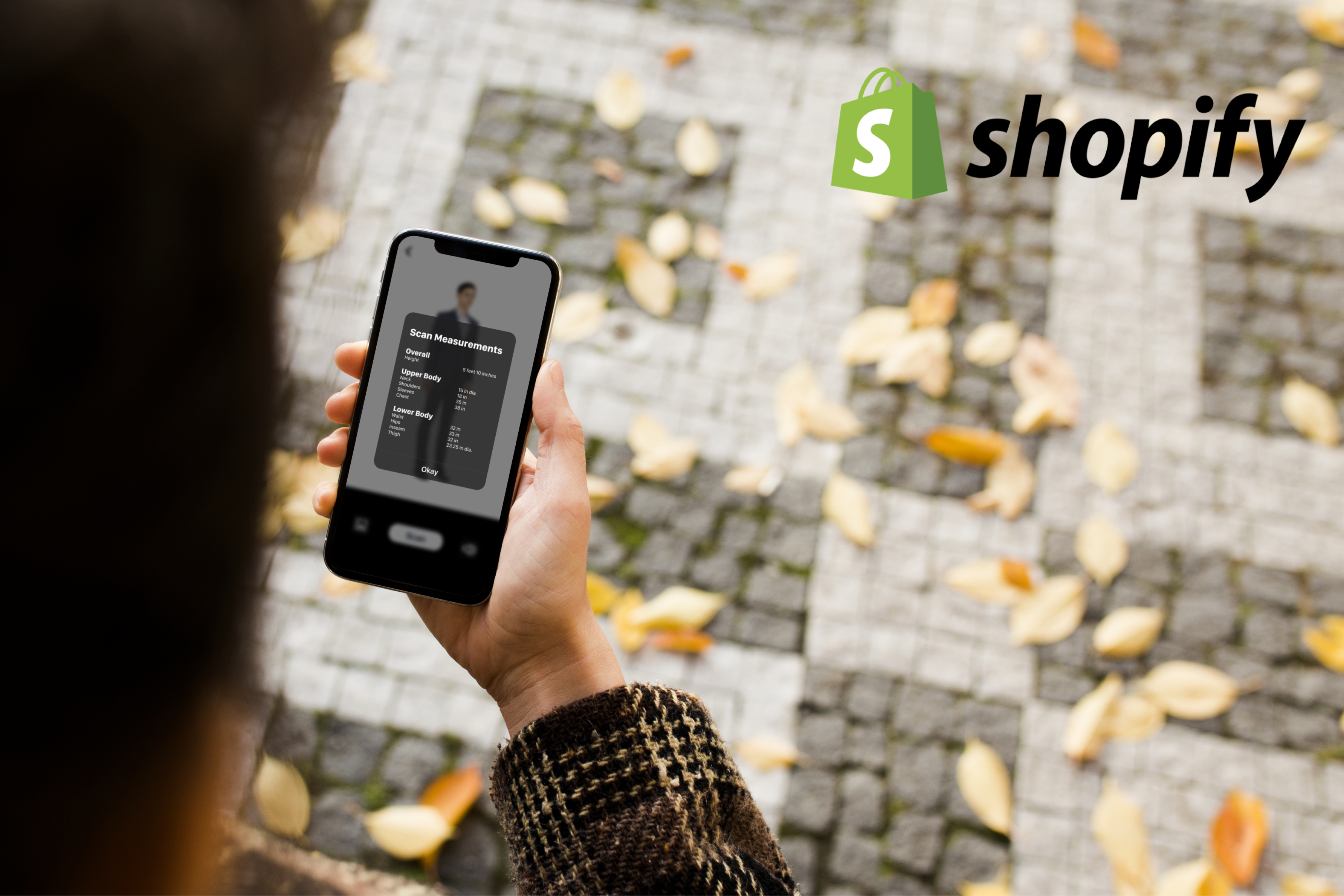
ShopifyUX Design Case Study
ConnectedResponsive Web Design
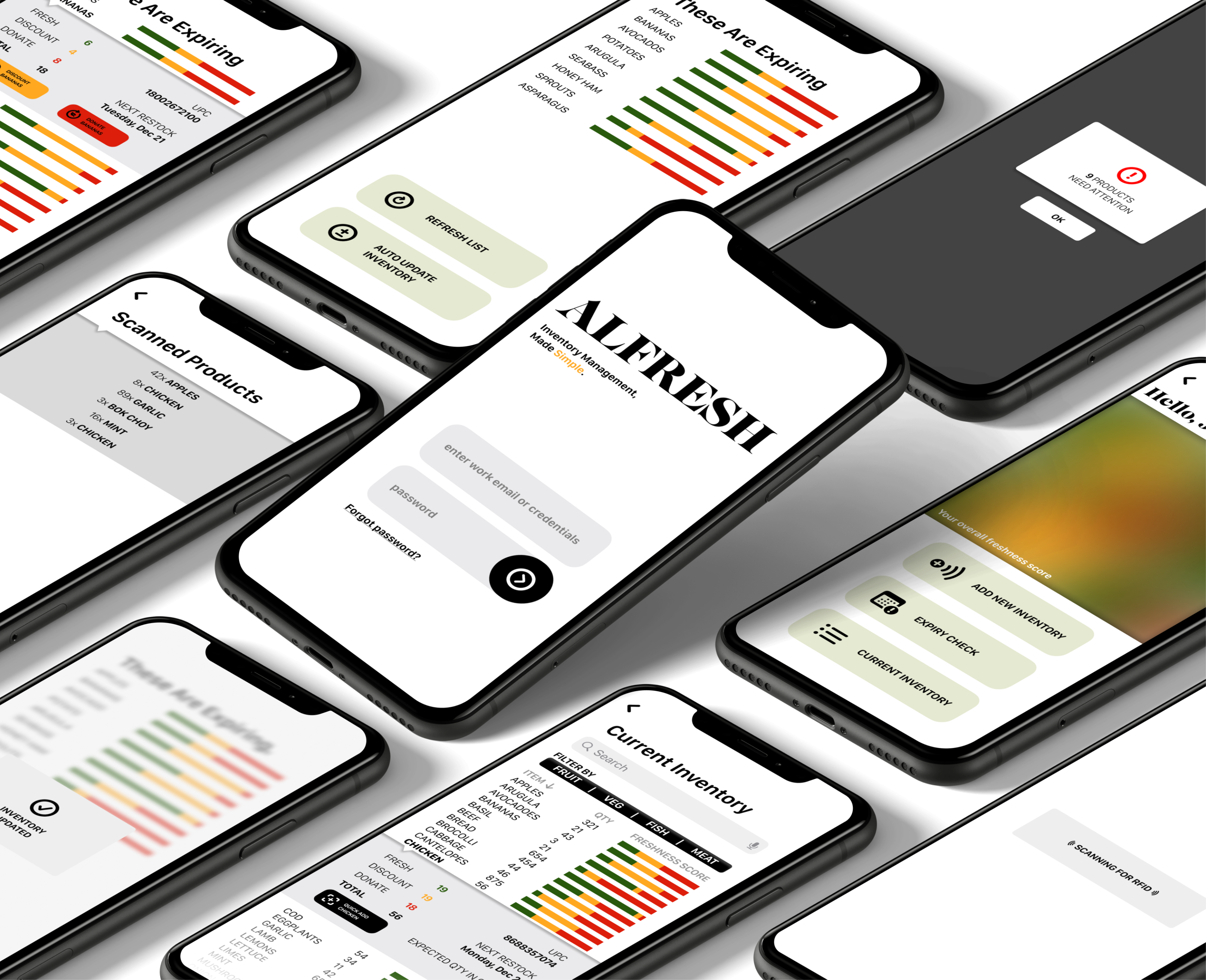
AlfreshUX Design Case Study
Let's Connect!