
Air Canada Heuristic Evaluation
Conducted a heuristic evaluation for Air Canada, assigned severity ratings on the usability and created improved designs based on usability assessment and heuristic evaluation. Improved design were built upon consistency and current system standards. Created a UI Library using the Atomic Design Methodology.

Project Goals
Project Lenght: 7 Days
Deliverables: Heuristic
Evaluation, Redesigns, UI
Library
Tools Used: Figma
and Sketch
1. Improve efficiency and usability for the task flow of purchasing a flight ticket using Aeroplan points on Air Canada
2. Improve transparency on Aeroplan to dollar conversion
3. Improve App preferment based on assigned heuristic evaluations and decrease the severity ratings
Why Air Canada?
For this case study, I collaborated with three other designers to redesign an existing website of our choice. We decided to target the Aeroplan loyalty program for Air Canada, which is a loyalty program where users can collect points, then use their points to purchase items. We focused on the task flow of purchasing a plane ticket using aeroplan points. Our project goal is to redesign the user flow, include conversion for Canadian dollars to aeroplan points thoughout the flow, allow users to filter their options, and redesign the visual identity of the website tom improve the overall user experience when using the website.
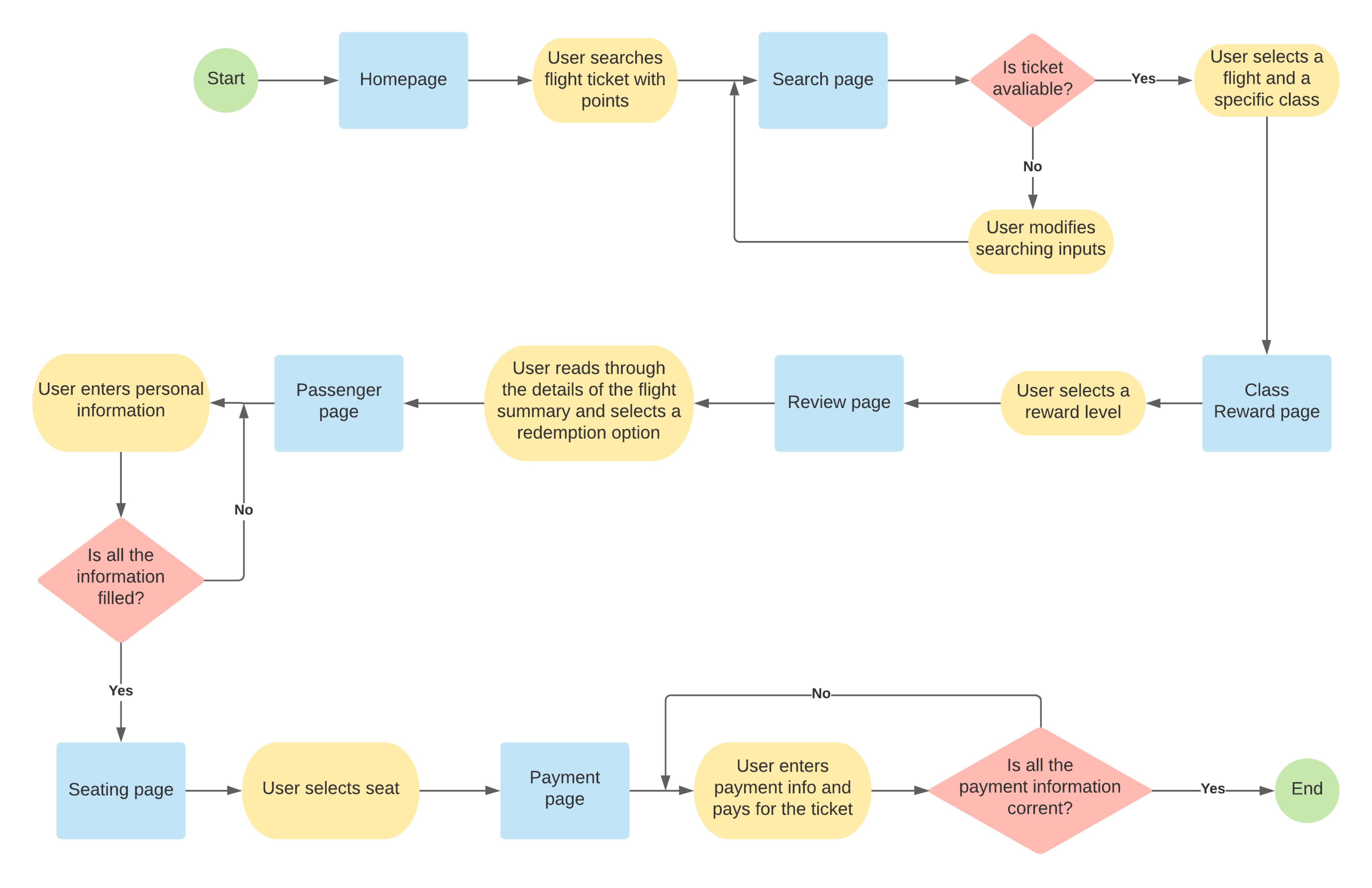
This is the task flow we conducted a heuristic evaluation on
Research
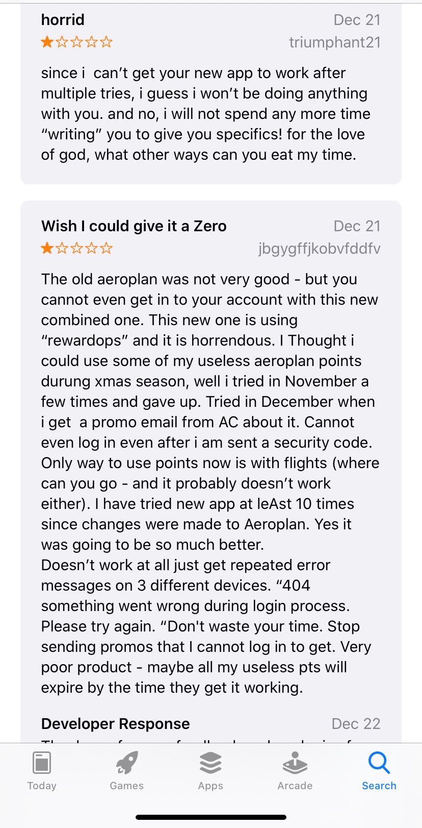
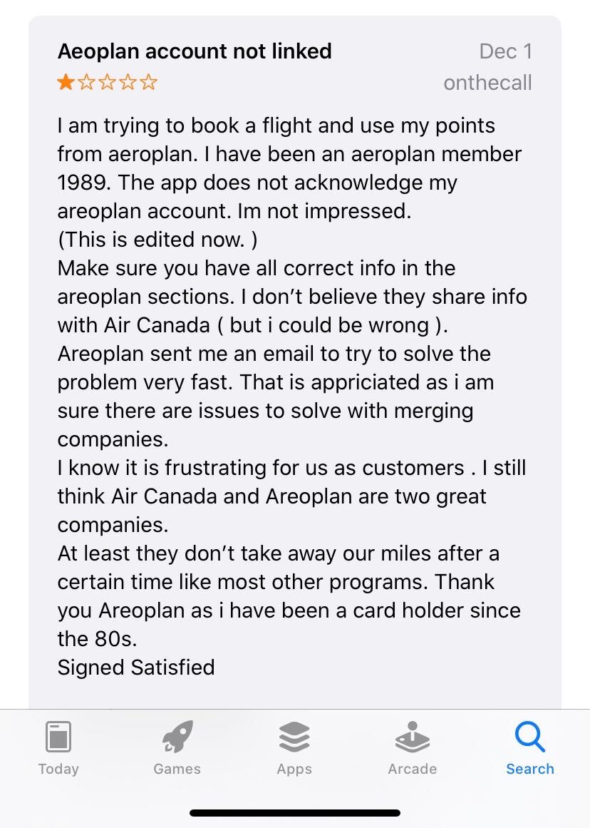
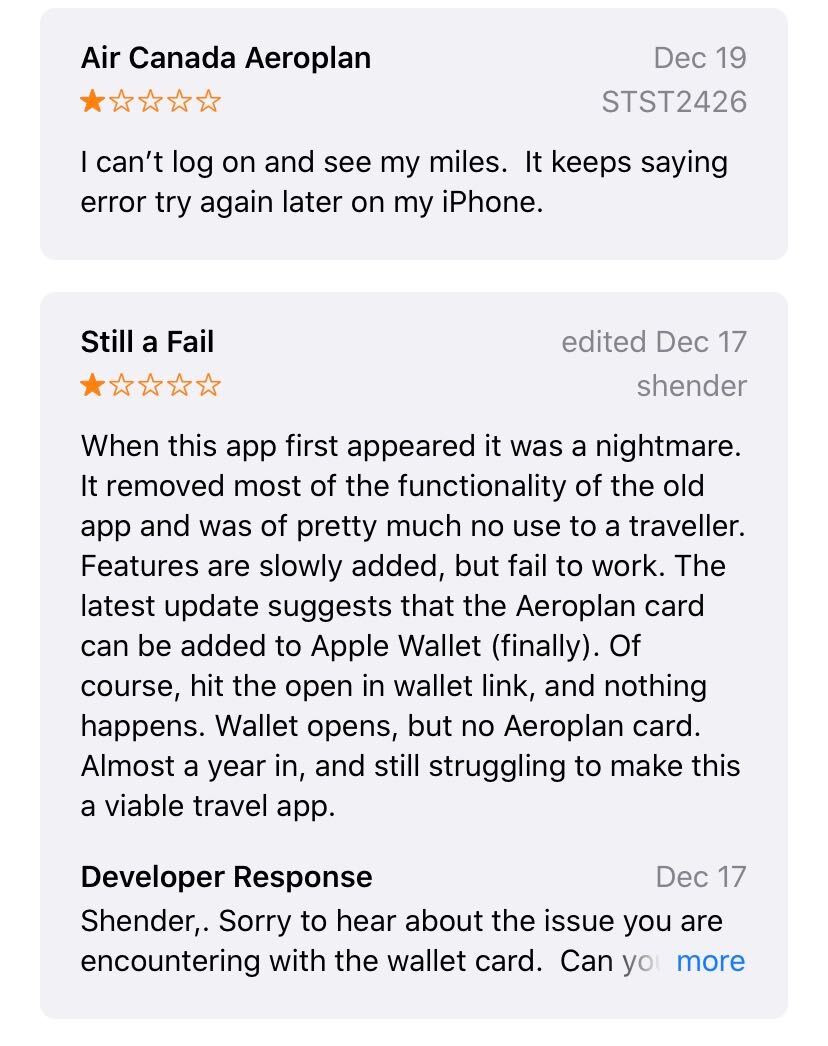
Before conducting a heuristic evaluation, we decided to conduct research on individuals experiences using the Air Canada website to recognize the paint points. We interviewed 3 people who have uesed Aeroplan points to purchase flight tickets recently and looked at online reviews for Air Canada's website. Here are some common pain points we found:
- It is not functional, a lot of people had trouble getting into their accounts
- The Aeroplan loyalty program does not give you all the information you need
- lack of customer support
- Very frusturating to go through a long process to use your points
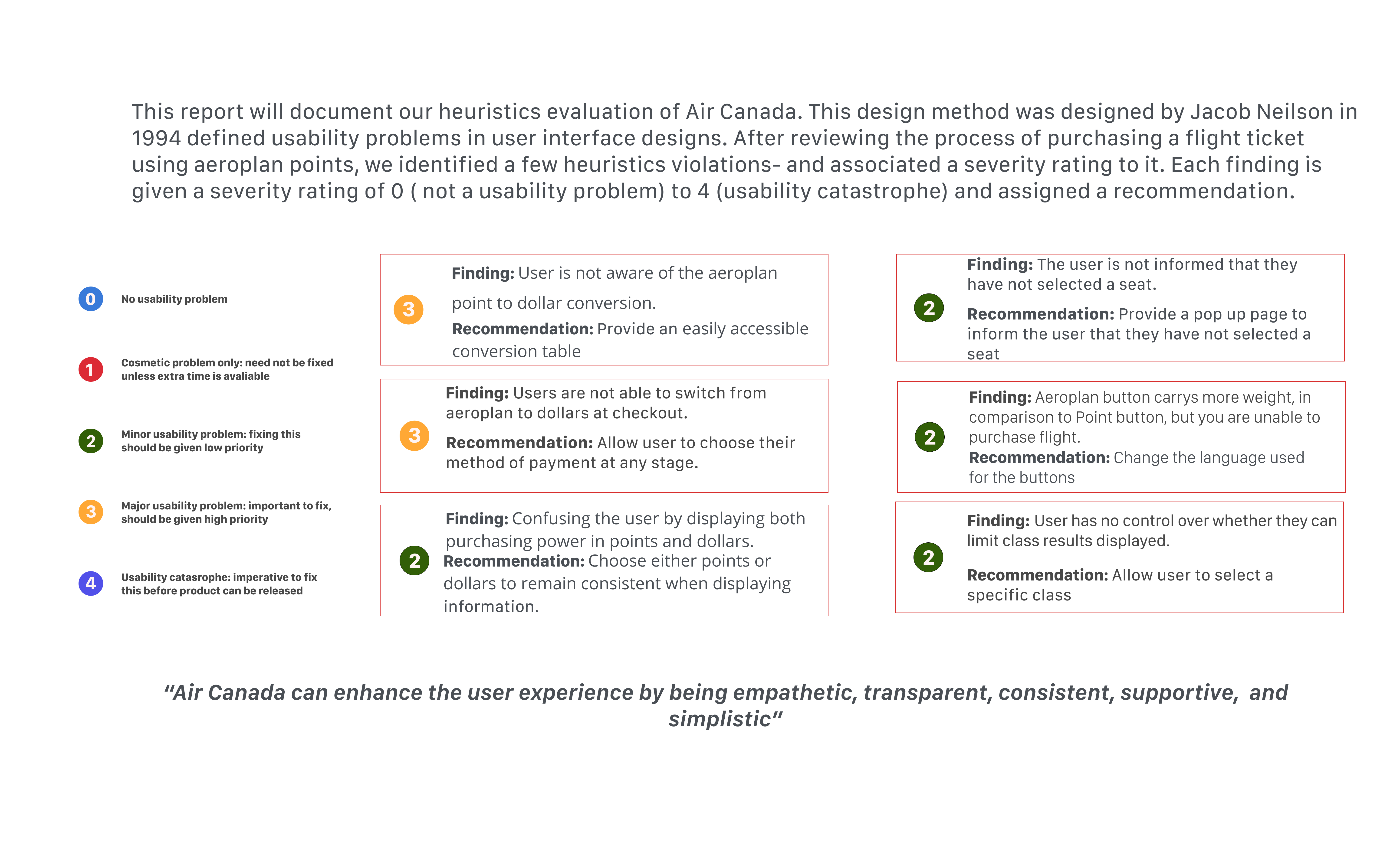
Executive Summary
Current Design
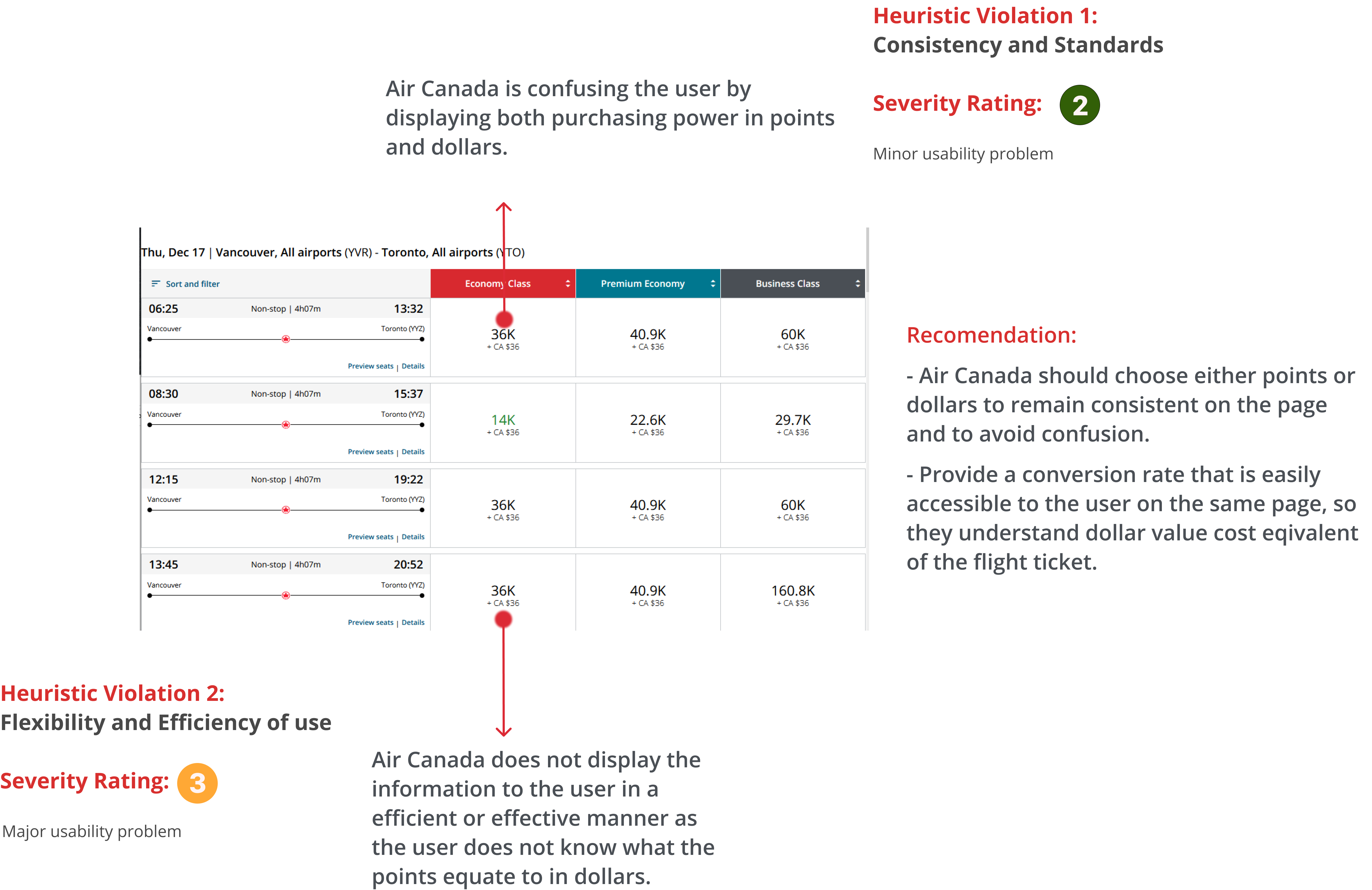
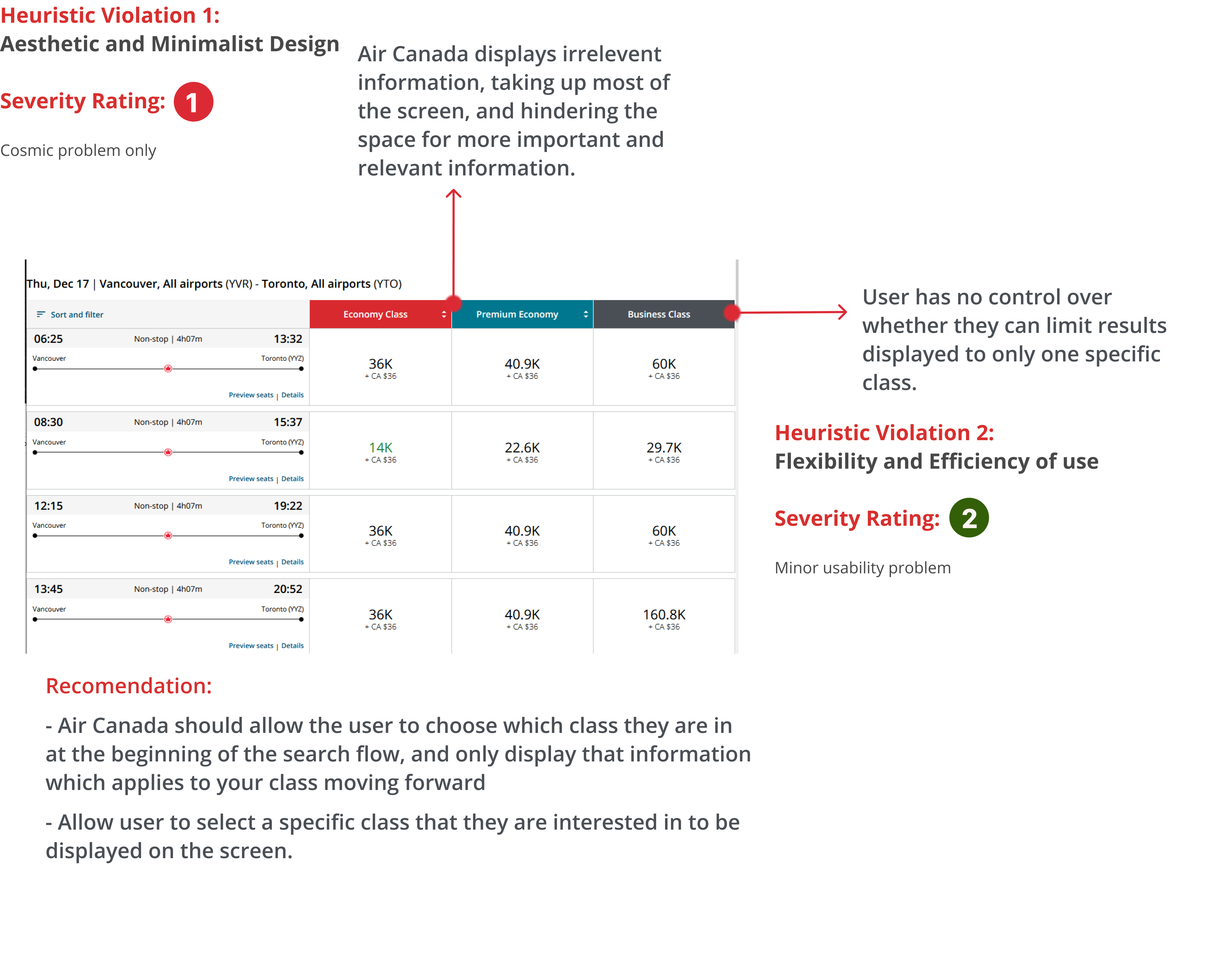
We conduced a heuristic evaluation the task flow of purchasing a flight ticket using Aeroplan points, below is an analysis on the heuristic violations we found, the severity rating for each violation and some of the paint points associated with the violation.
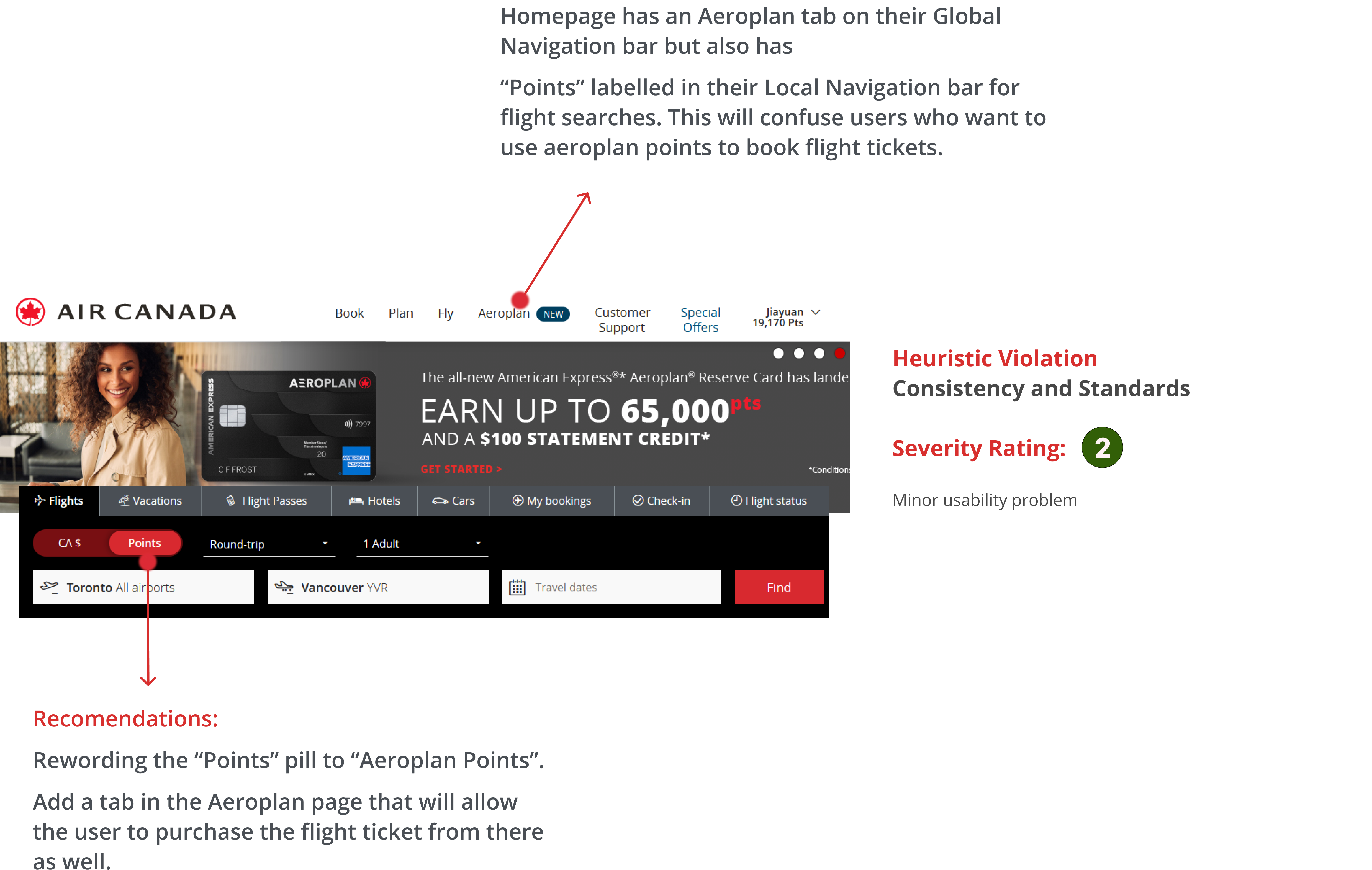
Home Page
Conversion between Aeroplan and Canadian Dollars
Filtering page by Economy, Premium, or Business
Transparency on Fees
Seat Selection
Check-out: Fees
Redesigns
My group and I redesigned the Air Canada website pages according to the heuristic violation we found. The redesigns were built to improve the overal usability of the Aeroplan loyalty program to purchase flight tickets. All of the redesigns were built on the current system standards to stay consistent with Air Canada's branding.
Home Page

Flight Selection Page
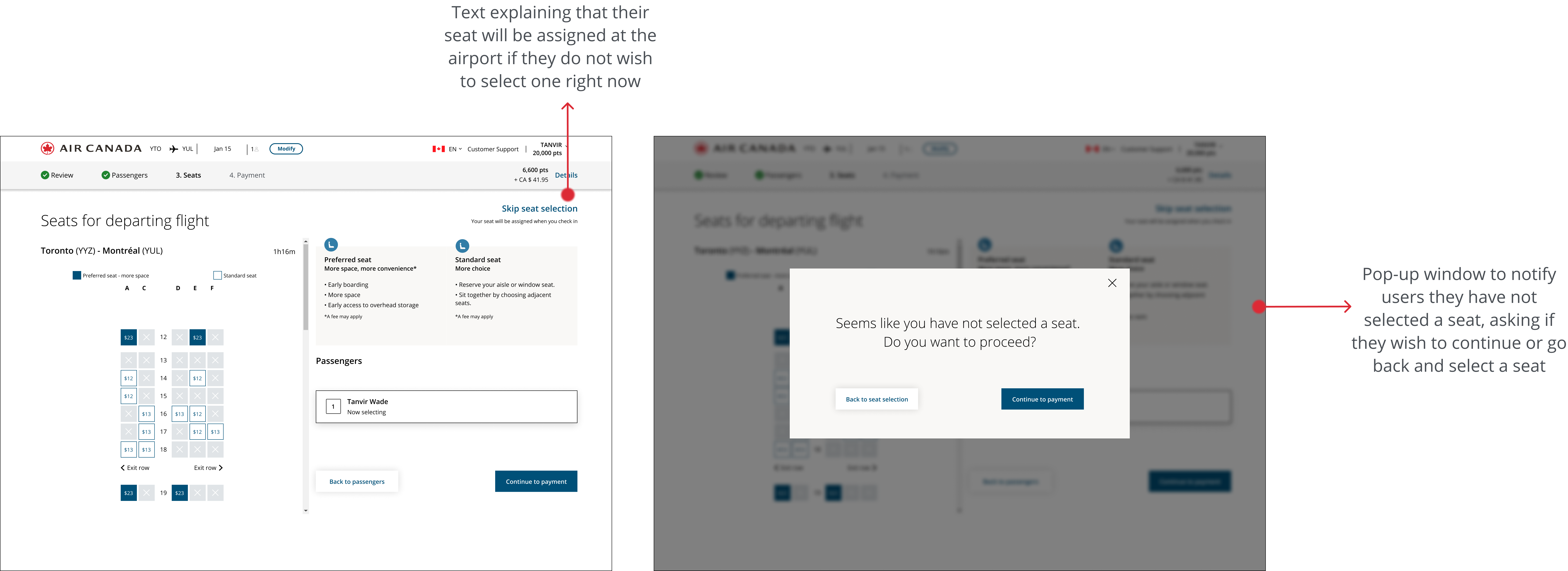
Seat Selection Page
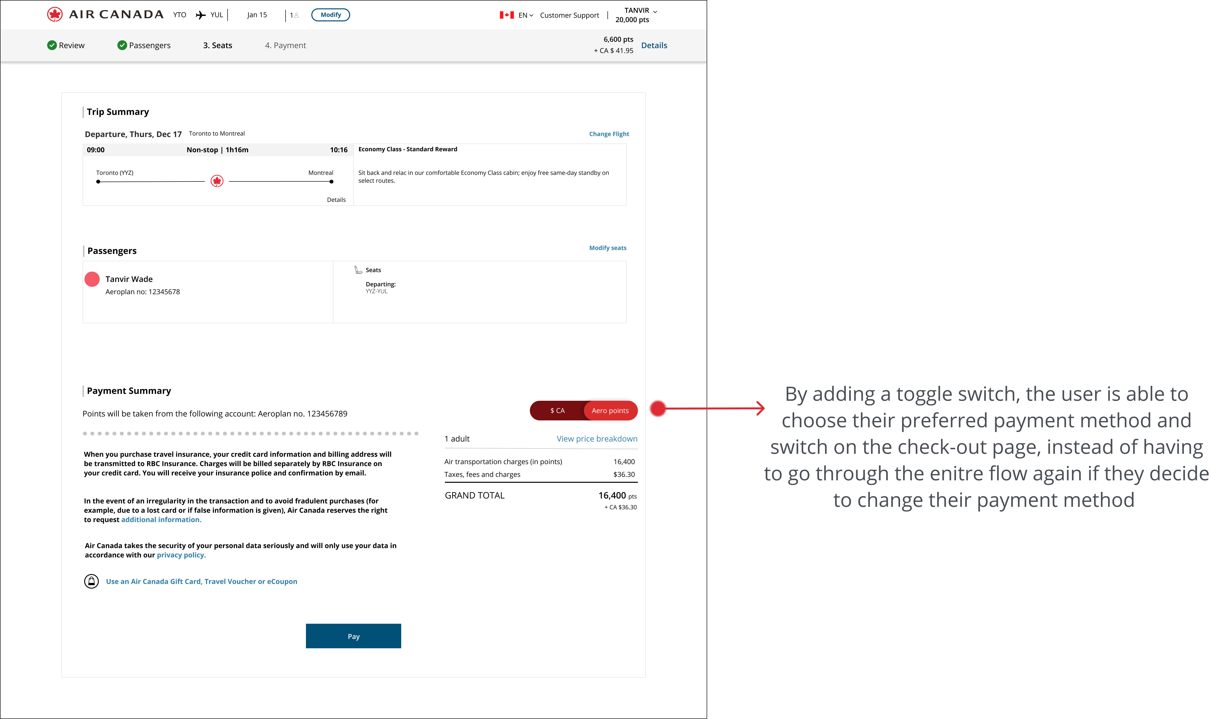
Check-Out Fees Page
UI Library
Atomic Design Methodology
Understanding the basic elements of the Air Canada application was critical in informing our re-design as it served as a vital guide on how to maintain brand and visual consistency. Drawing inspiration from Brad Frost’s atomic design methodology, our redesign approach was to first break down all the elements into basic building blocks, then rebuilding our final product using those same pieces to create hierarchy and cohesion.

Check out my work

ConnectedUX Design, Branding, Marketing

Air Canada Heuristic Evaluation, Redesign, UI Library

ShopifyUX Design Case Study
ConnectedResponsive Web Design
AlfreshUX Design Case Study
Let's Connect!